martes, 17 de diciembre de 2013

INFOGRAPHICS ABOUT UNEMPLOYMENT

 GOOD MORNING!!

In the epoque in which we are living, we see that unemployment, crysis, and, basically, a bad economic environment is present every day.

For this reason, I've decided to upload an infographic of unemployment in UE and of employment in UE. We can see this two kind of graphics explaining it. (At the left of graphic)

Then, at the right, you can see the decrease and the improve of  the sectors from 2000 to 2008. We can see that population left first and second sector, and started to work in the service sector because of the benefits.
I can say that the graphic is not abstract because the elements has a clear function. Is very visual and not complex to comprehend.
the bar charts and the circles serves to the viewer understanding very good the intention of the graphic.
it's not novel because the kind of format sound to the viewer.


Here there is an example of unemployment infographic: Young Hit Hard by the Obama

 http://rsc.scalise.house.gov/news/documentsingle.aspx?DocumentID=293375

From high school to grad school, students across the country are preparing to get their diplomas and move into the next phase of their lives. This is always a time of hope and excitement, but there is no denying the obstacles young people face in today’s economy. Many will have to move home to save money. Many will struggle to find work. And those who can strike out on their own often won’t earn what they would have 5 years ago.


THANK FOR YOUR ATTENTION!

lunes, 16 de diciembre de 2013

AIRCRASH INFOGRAPHIC

GOOD MORNING!!!
Today I will upload an infographic of aircrashes.
The first one is my infographic.
There is a mapa mundi with planes that simbolize where were exactly the accidents. Next to the planes appear the names of the cities with aircrashes and the number of deaths.
as you can see my infographic looks similar as the infographic that I find on internet: http://www.travelinsurance.org/the-deadliest-airplane-accidents-infographic/
That means that my infographic is made in a familiar way. I've also made it in a easier way to understand, it's reflect with the planes in the place where the accident occurs, that makes visual the information. Moreover, if the viewer doesn't understand at all the infographic, he/she has written information.
This infographic is not abstract, it's true that there isn't too much text but is really understandable what it means.
It's not novel my graphic because it sound on the viewer surely. The kind of format that it has is quite recognizable for the viewer.

                      MY INFOGRAPHIC


EXAMPLE OF INTERNET "http://www.travelinsurance.org/the-deadliest-airplane-accidents-infographic/"

In this graphic it's expressed the deadliest airplane accidents all over the world. it's more complex that my graphic because of the information that is on the bottom of the page. Is more elaborated because of the format too.
It's functional because every element has his function, but also has a decorative aspect, the plane that is on the top...
how ever is understandable and they achieve its information purpose.


THANK YOU FOR YOUR ATENTION!

viernes, 13 de diciembre de 2013

How we started doing graphics?

Good Morning!!!!!

Today I've decided to upload this graphic for showing how we started to control Indesign.

First of all, we have to learn how we make lines, straight lines and curved lines. There are some combinations in Indesign for doing it (pressing shift, control+shift...) it's something that you'll have to learn.

when you know perfectly making lines, you can start to make more elaborated draws, as stars, hearts, clouds...


I add also this graphic, from BegoñaGonzalez, http://explainitgraphically.blogspot.com.es,
that is another example of how we can started to learn about making graphics.


THANK YOU FOR YOUR ATTENTION!!!

jueves, 12 de diciembre de 2013

sometimes graphics don't like....

Good morning!

I’ve decided to upload this practice that was one of the firsts that I did in my graphic design course.

I’ve tried this one to make a constructive critique for showing also the errors I’ve made.

There are, at the top, all the planets, in an ordered way. But despite the fact of being in a correct order, they don’t mean anything. There is only the solar system.
I mean, at the top, appear the solar system, and at the bottom, there is all the text.
I think that it’s not easy to understand. For viewer is too difficult to organize the information and comprehend it because the letter is not understandable at all, and all the text is together with a few spaces.
Finally I want to recommend you that you have to be patient; you have to try to make a graphic easier to organize the information.
It's no novelty, non-abstract, but the text converts the graphic as functional because it expresses all the information.
the planets have the decorative mean. 

And I give you a encouraged message if you make a catastrophic infographic: Don’t worry!! It’s normal in your first graphics because you need experience and make more than 1 and 2!


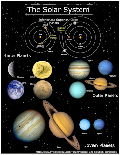
"http://www.mycollegepal.com/infographics/solar-system-modern-ancient"

This infographic is also a solar system graphic that explains about it. It's better than mine because it has less text, it has a title very clear.
the information achieve his goal, all viewers understand more or less what the graphic tries to explain. The idea of putting images instead of drawings of planets appears also in my graphic.


THANK YOU FOR YOUR ATENTIONNNN!! 

miércoles, 11 de diciembre de 2013

What we could explain a robbery through an infographic?

GOOD MORNING GRAPHIC DESIGNERS!!!!

Today I will upload an infographic that explains the incredible robbery of boston of 1990.

This infographic is a maze in which all the robbery's story happened. 

You have to start from the top and from left and you will find a location: where and when. This location is explained by images and draws for making more visual the explanation and for a better comprehension. 


With the white and black flag, the audience have to understand that the robbery starts. Two mans dressed as policemen enter in the Garden Museum in order to robber very valuable art pieces
I've shown these pieces with images of them because the viewer rapidly relates the pieces to the author. 

There is also a map with crosses that explain where were the stolen pieces. 

Finally there is an explanation of what happens with the thieves after the robbery through text in a box and with draws.

The maze finishes with the finally of the story and another time with a flag.


At the bottom of the infographic there are 6 museums that also suffered a robbery. The color represents the quantity of money that was stolen from the museum. The color's intensity means the robber's intensity. 

This graphic is made in a familiar way because I wanted to make it easier to comprehend. It has lots of elements and it could be too much dense for the viewer but these elements are in the graphic for making it visual.

Finally, the idea of drawing a maze was for collecting all the information in a line way. Therefore, the viewer follows the graphic in the order that I want. 
It's more abstract than figurative because the information is expressed by images or drawings. It's also true that it appears text for making clear the information. 


Another example of Boston's Robbery, maybe the designer work harder than me or know more than me, but it's a really good graphic.
JULIA REÑÉ
http://infographicsbyformat.blogspot.com.es/.
This graphic is really abstract because the ideas are in a organized way but it takes a reversed S form with a column that crosses the reversed S and complete the information of the robbery.
Is very functional because the elements that appear, although being in a specific organization, are not in the infographic for decorating are for explaining the robbery.
Is very original because the kind of format doesn't sound to the viewers, then is also novelty too.
How ever, is understandable and very visual.

THANK YOU FOR YOUR ATENTIOOOOON!

martes, 10 de diciembre de 2013

An example of CV!!

Let's start with our graphics!! 

The first graphic that I'm going to explain you is my curriculum vitae.

At the top of the graphic there is my educational training, my marks and the degrees I've done. The colour blue of the bar charts means the level of difficulty on my studies. Through the time it has been easier for me to get a dynamic studie. For this reason, the colour blue is in decrease. 
There is also my name and age for presentig myself.

At the middle of the page, in the left, there is my work experience. I explain it through a pie chart. There is also a photo of me, for helping people to understand better with visuals who I am. The colour dark red is related with my work experience because it's an stage very intense, like colour, of my life.

Finally,
at the bottom of the page there are: 
- Extrapoints that I've explained it through images for a better comprehension. 
- My personal skills that are explained with pie charts. I've explained it using colour pink because I'm a sensitive, tender and sympathetic person. I've also tried to put some slogans for creating shock to my possible boss.
I think my infographic is very visual, easy to understand, and also familiar because of the bar charts, the pie charts... 
Also it sounds to the viewer, then is a little redundant and not novelty.


Another example of Curriculum Vitae of a pascal's website, a German's designer. I recommend you to visit his website: http://cogitatiosublime.blogspot.com.es because he explains very good what consists the preparation of a CV infographic.


THANK YOU FOR YOUR ATENTIOOOON!