Good
morning!
I’ve decided to upload this practice that was one of the firsts that I
did in my graphic design course.
I’ve tried this one to make a constructive
critique for showing also the errors I’ve made.
There are,
at the top, all the planets, in an ordered way. But despite the fact of being
in a correct order, they don’t mean anything. There is only the solar system.
I mean, at
the top, appear the solar system, and at the bottom, there is all the text.
I think
that it’s not easy to understand. For viewer is too difficult to organize the
information and comprehend it because the letter is not understandable at all,
and all the text is together with a few spaces.
Finally I
want to recommend you that you have to be patient; you have to try to make a
graphic easier to organize the information.
It's no novelty, non-abstract, but the text converts the graphic as functional because it expresses all the information.
the planets have the decorative mean.
It's no novelty, non-abstract, but the text converts the graphic as functional because it expresses all the information.
the planets have the decorative mean.
And I give
you a encouraged message if you make a catastrophic infographic: Don’t worry!!
It’s normal in your first graphics because you need experience and make more than
1 and 2!
"http://www.mycollegepal.com/infographics/solar-system-modern-ancient"
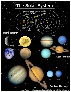
This infographic is also a solar system graphic that explains about it. It's better than mine because it has less text, it has a title very clear.
the information achieve his goal, all viewers understand more or less what the graphic tries to explain. The idea of putting images instead of drawings of planets appears also in my graphic.
THANK YOU FOR YOUR ATENTIONNNN!!


Hi Andrea! I must say that i like your graphic because although there is a quite long text, the information is well distributed and everyone could understand it. Well done!
ResponderEliminarI like the look of the different planets - it looks very professional! And even though it's not that original with a black background for an info graphic about the solar system, it suits perfect. I'm not that big a fan of too much text in a graphic - you should show it instead of telling it. But it of course depends on the purpose of the graphic - sometimes text are needed. Especially if there is no additional article to explain the context.
ResponderEliminarI like your work in this info graphic - the planets look very realistic with the different surfaces. Good job. However, I would cut some of the text as it draws my attention too much.
ResponderEliminarIn addition to that, I think you could have used grids in order to make the text more structured and thereby easier to read.
And: There is no headline on the infographic - so I do not know what it is about.
Hi Andrea! You represent a good infographic: good colors and good draw, but if you cut some of your text you will improve this good graphic about the planets ;)
ResponderEliminar